Are you getting a “good” employee participation level? Know where you stand


Worker participation rate
At Celpax we’ve known for a long time that it’s key to fix the “problem” of getting employees to participate when improving your work culture.
Many leaders know just how difficult it is to get their colleagues to keep participating.
Two years after the Celpax was born, we had leaders who thought it was low to get 56% of their employees pressing the green or red button every day to give mood feedback.
Others were super happy at a 23% participation level!
Of course it all depends what you compare to: Define participation
So what should we compare our participation rates with? With annual employee surveys? Or the levels you get during national elections?
But are those really comparable? They’re different in nature.
For us, the conclusion is that there is no reference.
Some participation numbers take place once a year, some are in-depth…
Annual isn’t daily. What other daily mechanisms are there?
Yearly vs. Daily participation rates
The average employee survey response rate is 40% according to Forbes, it might be higher in your company (it sure was where I previously worked).
This is a survey you send once a year though.
And information that you request and info you volunteer to give is also different.
We see ourselves too different from employee surveys to be compared, we are more in the business of simplicity and DIY (Do It Yourself).
We like to see ourselves like a heart rate monitor you use for your daily runs.
A heart rate monitor might not be a medical checkup, but all athletes use one to improve. It tells you how your training went, if you’re getting fit, we kind of do the same…
Both are related to health, but not really comparable.
Know what’s possible - know where you stand
One day we had a US company starting to measure their employee mood.
We knew the Celpax device on the worksite wasn’t reaching its full potential as they were getting a low number of pulses. We recommended our standard “How To Fix It” tips and tricks.
But the company didn’t really react.
So a few days later we simply said “look, you’re only getting 1/5 of the pulses that others are getting“. That did the trick!
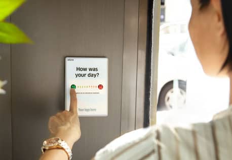
Turns out they had placed their Celpax in a spot where employees faced the side of the device, not the front with the smileys.
When they moved their Celpax their participation immediately popped up to “normal” levels.
We realized the power of comparisons!
So my colleague Sergi sat down a created a dashboard section that allows you to check your employee participation levels to others to know where you stand.
Over time you can also compare against your company’s historical data, and adjust the numbers of employees when you have significant changes..
Participation Goal – how are the cool kids doing?
Watching others is how we learn and evolve our product.
Checking out their methods and comparing them to yours opens up your mind to new possibilities. This is why I interview Celpax enthusiasts. So you too can learn and improve faster.
We gathered the cool kids under “Participation Goal”: these are companies where the Celpax is having a positive impact and where they keep up a nice number of pulses (long-term).
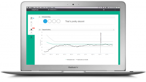
This is the green line on your participation analysis! You can compare this to the black line, which shows your participation.
The grey line shows the typical higher and lower participation levels. That’s the mean minus one and plus one standard deviation for you analytics geeks.
A simple rating tells you how you’re doing
Let’s keep it simple:
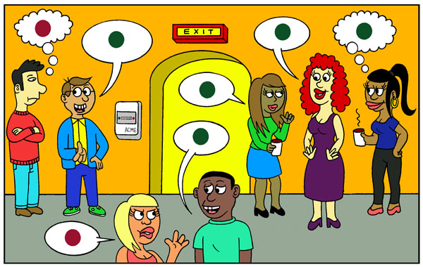
We give you blue dots so you know how GOOD you’re doing. It’s the same pattern as when we analyze a day in your company.

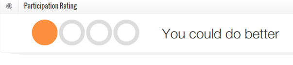
We give you orange dots so you know if the system thinks you could do better. If this is the case, we hope other people’s stories or our FAQs will inspire you.
Spoiler alert: This isn’t an exact number
The default value in our system is that 100% of your employees are in your office every day.
But of course, people get sick, take personal days, Summer holidays kicks in, there’s remote workers, seasonal workers…
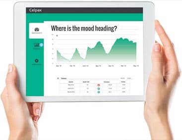
The most interesting data, same as with your Mood KPI, is where you’re heading over time. Is your typical participation going up or down?
I previously wrote about it here.
So what is a good participation level for a system where you press red or green to signal how your workday went?
Where do you stand?
Log in to your new “Participation” tab on your dashboard to find out, or grab a device and start measuring your employee mood in real-time 😉

 Hej! I’m Rebecca, co-owner at Celpax. We believe in creating a better society by empowering employees and leaders to create a better workplace, together. We use simple tools to help them get there. I might appear in our chat, or say aloha on twitter?
Similar interests
- Non Gamstop Casinos UK
- Slot Sites UK
- New Betting Sites UK
- Casinos Not On Gamstop
- Gambling Sites Not On Gamstop
- Casino Non Aams Sicuri
- UK Online Casinos Not On Gamstop
- Gambling Sites Not On Gamstop
- Sites Not On Gamstop
- Sites Not On Gamstop
- Non Gamstop Casino Sites UK
- Best Online Casino Canada
- UK Casino Not On Gamstop
- Non Gamstop Casinos
- Casinos Not On Gamstop
- Siti Scommesse
- Top Casino Sites UK
- Slots Not On Gamstop
- Casino En Ligne Meilleur Site
- Casinos Not On Gamstop
- Betting Sites UK
- Slots Not On Gamstop
- UK Casino Not On Gamstop
- Migliori Casino Online Non Aams
- Non Gamstop Casino UK
- Lista Casino Online Non Aams
- Meilleur Casino En Ligne
- Best Crypto Casino
- Casino En Ligne
- Casino Online
- Casino En Ligne France
- Paris Sportif Ufc
- Casino Jeux En Ligne
- Meilleur Casino En Ligne
- Bonus Free Spin Senza Deposito
- Casinò Non Aams Con Free Spin Senza Deposito
- Nuovi Casino Non Aams
- Migliori Casino Online
- Crypto Casino
- Casino Non Aams
- Casinò Non Aams
- Migliori Casino Non AAMS
- Lista Casino Non Aams
- Giochi Senza AAMS
- Migliori Siti Scommesse Non Aams
- Migliori Casino Online
- Casino En Ligne Le Plus Payant

2 Comments