- You access the pulse survey results online
- No software to download
- Weekly email update sent every Monday
DASHBOARD (HOME)
The Mood KPI is your baseline. Think of it as “where you are” or what result to expect on a normal day.
In this case, 71% normally press the green button leaving work. 29% press the red button. It’s a rolling average, and is calculated using all your pulses from your last 30 days.
- Compare work locations: Click on your site name, in this case, “Headquarters” to compare Mood KPI’s
- This week shows how you’re doing so far this week
- Yesterday shows you the Day Rating (if there was a result that stood out the day before, otherwise it’s just shown as a neutral day)
- Last week shows how last week went
- You see the total number of days you’ve measured, and how many times people have pressed the buttons. Under “Stages”, we explain your progress as you unlock different sections over time
- Activity feed: The system alerts you through weekly email updates with messages like "last week was your greenest week in the last 12 weeks". (i.e. your best week in the last 3 months in terms of absolute pulses).
TRENDS
Check your mood results by month, week and day.
In this example, the company can see how different actions and events affected their employee mood. You see how deep each crisis is, and how long it takes to recover their Mood KPI. They’ve been getting a lot more green the last 2 months.
- Under the “Days” tab, it shows the day rating from “Day Analysis” (see below) to detect days that stand out. Click on a star to go to the Day Analysis.
DAY ANALYSIS
After 75 days, when the system has enough days to establish how your people feel on a ‘normal’ workday, it analyzes the impact of events, communications etc. You will know if you need to take action or alert a manager at any of your work locations (like this guy!).
A simple rating system uses
- Green stars to tell you how good the day was (the more green dots, the better!)
- Red dots if it was bad (the more red dots, the worse)
- Blue dots if you got more participation than you normally get
- Empty stars: Neutral day, a "normal" day
- No symbol: Not enough participation to calculate
The rating takes into account both the % of green, and the number of presses you got. In this example, they had a very bad day at work. They had a higher level of participation than on a normal/expected day, and a lower level of green.
You can download the breakdown if you have shift workers, etc. Example here.
PARTICIPATION ANALYSIS
The % of participation is an indicator of how you work with the system. It's proportional to the things you do.
Check if you’re getting a “good” level of presses: compare to others to know where you stand.
We gathered the cool kids under “Participation Goal”: companies where the Celpax is having a positive impact and where they keep up a nice number of pulses (long-term). This is the green line. The grey lines show you the lower and upper limits (standard deviation).
Your participation % is the black line.
A simple rating tells you how you’re doing:
- 1-4 blue dots if you’re doing well.
- 1-4 orange dots if the system thinks you could do better.
The company in this example is doing great! They most likely communicate their results regularly, and talk to employees about how to fix what makes people press red.
The typical participation is based on how many people you say work at each location. We count 100% of employees to be in every day. We exclude days that are different from a "normal" day, i.e. holidays, weekends, etc.or days with a spike in participation.
ADVANCED
- The upper green chart shows you the % of green per day: each day is one grey bar.
- The lower blue chart is your participation: each grey bar is one day.
- If you hover over, more data will appear.
- Typical pulses guides you on how many presses you have on a normal day. I.e. you normally get 45% presses per day.
- Pulses show how many pulses you had on a given day, i.e. 48% participation.
- Zoom in to different time periods, either by pressing the buttons, or using the slider.
- Press the cloud icon to download the data as an excel file (.csv) to correlate with other company KPI’s like production, revenue, etc.
The advanced section shows you raw data which hasn’t been processed. Unless you’re a black-belt-analytics lover, we recommend sticking to the Analysis section.
Custom Report
Find data insights that aren't on your dashboard yet!
- Are people happier on one weekday?
- Do you have differences between work shifts?
- Correlate with other data like incident reports or productivity
You can also Do-It-Yourself with our API.
DEPLOYMENT (your first 45 days, under Analysis / Trends)
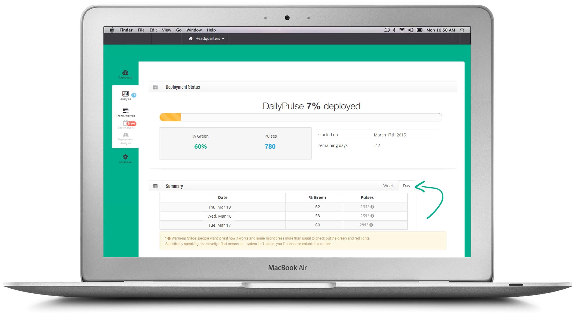 The daily and weekly results during the first 45 days are shown here, as you wait to unlock your Mood KPI.
- The first 14 days is your warm-up period: People want to test how the Celpax works and some might press more than usual to check out the green and red lights. We see that in most accounts! Statistically speaking, the novelty effect means the system isn’t stable, you first need to establish a routine.
- The preliminary Mood KPI in this example is 60% green.
- Click on the "Day" tab to see the mood results per day.
CONFIGURATION
- Change how many employees typically work at your site. You can also put a % per day. I.e. 20% work on Saturdays. The more accurate, the better our algorithms work. By default we will use the data you provided us with when signing up. You can either change the number for the entire period you've been measuring, or add a new period. I.e. "starting October 1st we have 40 people".
- Change the name of your sites / locations.
- If you’re looking to show the results automatically on your intranet or TV screens, the API keys here. You will need someone with basic coding skills to implement it.
Other features
- Change site: Compare the employee mood between your work sites
- Email support: Got questions? Just click and send us your request (paid feature)
- Billing: Pay directly with credit card, less hassle :)
ADMIN ACCESS
We recommend asking yourself: Who will act on the results?
Who will talk to the employees to find out why it’s so red? And do something about it?
This person should have admin access so s/he can get insights to how people react to the actions you take, receive weekly email updates and verify how the Mood KPI develops.
You can add as many people as you'd like. Just click on the "invite admins" button.
A great workplace is everyone's job.
EMPLOYEE ACCESS
Any employee with a valid company email can get limited access to the dashboard result.
There are 2 ways to get access:
- The employee (using their work email) sign up via users.celpax.com
- You can also invite them by clicking on the "invite admins" button at the top. Instead of pressing "send invite", click on the arrow and select "Invite without admin privileges".
Under Configuration, the admins can change the number of weeks you'd like to share with them. We recommend sharing at least 3 months of results. Employees can ask others to join by clicking on "Invite your colleagues".
Some companies invite all their employees to see the full results to add transparency.